TOQUE
A no-frills recipe gathering and sharing app with a twist: A focus on sustainability and combating food waste
TOQUE needed help to redesign their recipe gathering and sharing app to be more engaging and help them retain a higher number of users
Guiding TOQUE's recipe app redesign, I prioritized features based on extensive research. While TOQUE sought several new additions, user feedback highlighted a preference for a feature addressing food wastage over others, which became the Minimum Viable Product for TOQUE.
Problem
Users need a way to use digital to plan and prepare meals to reduce food waste
Solution
Based on what users expressed, they desire and need a feature that helps them reduce food wastage
Keep scrolling to see my Design Process
Keep scrolling to see my Design Process
Discover
Competitive Analysis
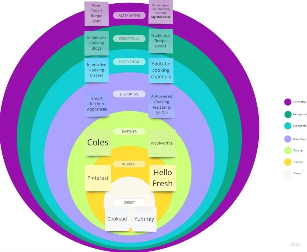
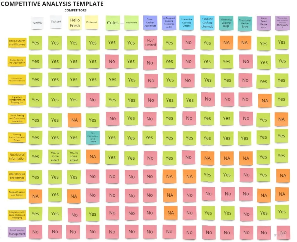
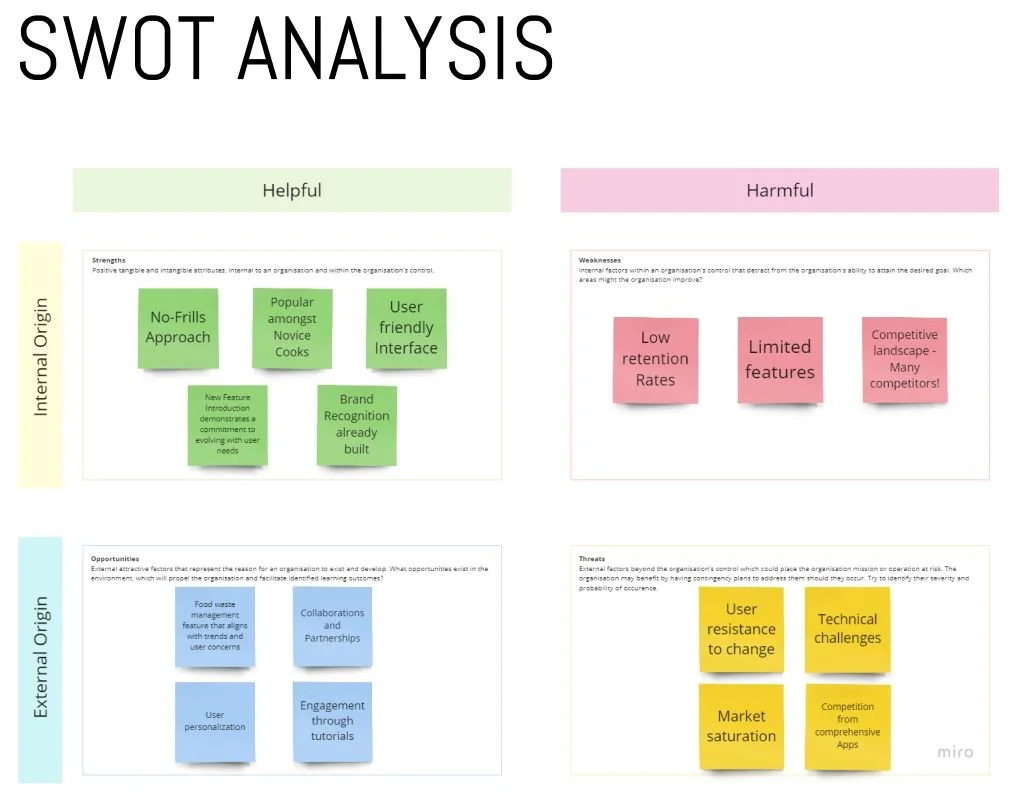
The project began with extensive research - Starting with exploring TOQUE's competitors since it plays a vital role in the UX design process and allow TOQUE to grasp the bigger picture of their product.
The aim of this analysis is to stand out from the crowd by designing a distinctive user experience that sets TOQUE apart.
Define
User Insights
During the Discover phase, I conducted user interviews using a carefully crafted script with 24 open-ended questions to shape new personas and guide the design process. Within a day, I remotely interviewed four users, focusing on their values, motivations, and daily routines.
Let me introduce you to Emily, a representative of TOQUE's target audience, who collaborated in designing an MVP product, ensuring her needs were addressed, and played a key role in summarizing and communicating the research findings for this specific audience throughout the entire design process.
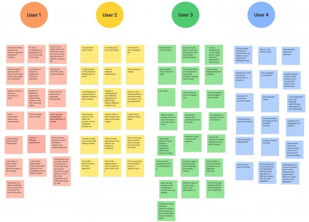
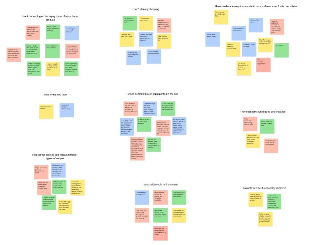
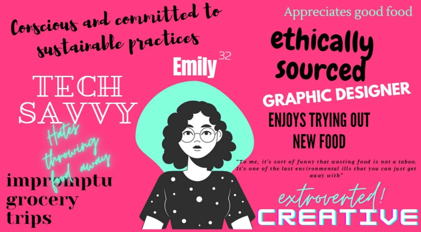
"I cook depending on the expiry date of my products that I already have at home"
Design
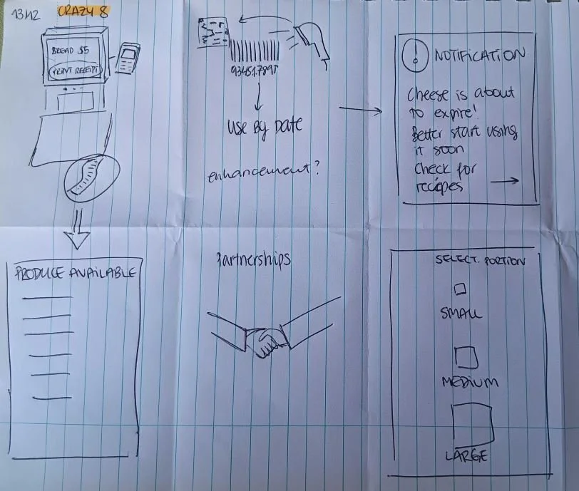
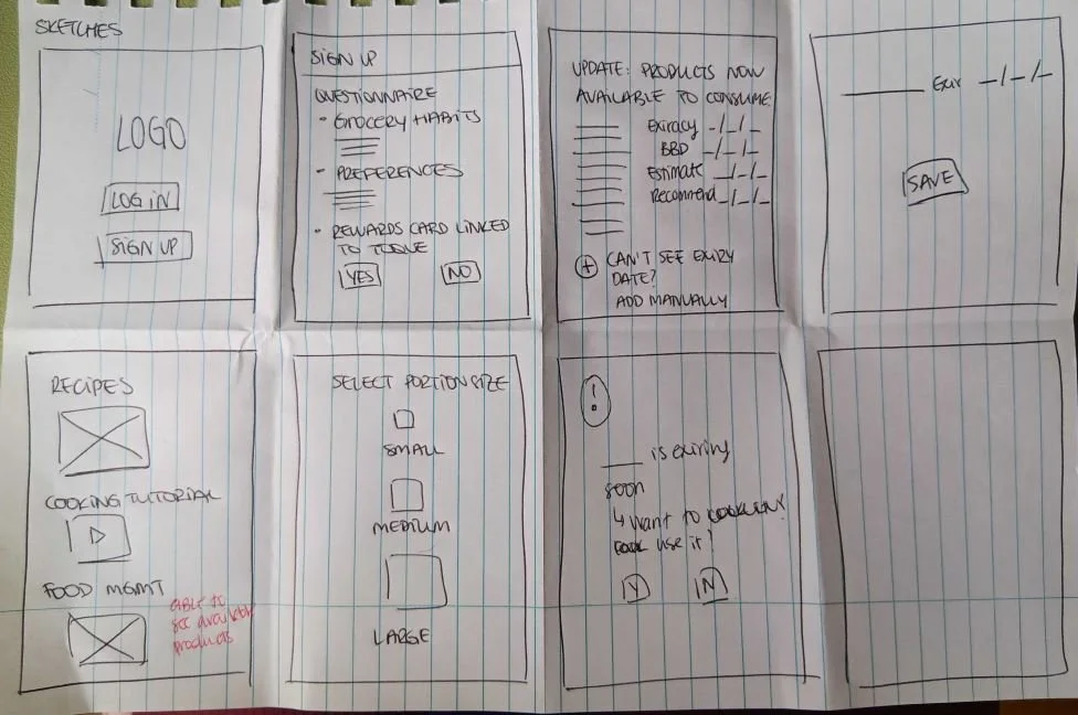
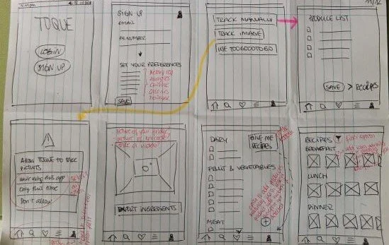
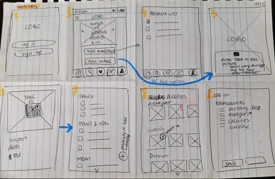
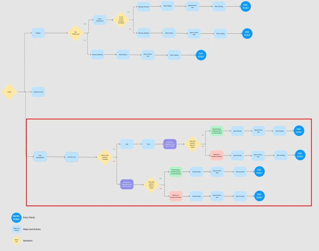
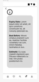
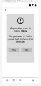
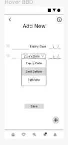
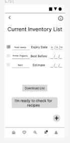
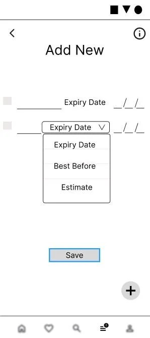
After analyzing the user insights, I started to brainstorm potential solutions. I sketched out tons of ideas, mapped out user flows, and finally, brought it all to life with a low-fidelity prototype on Figma.
Deliver
Usability Testing
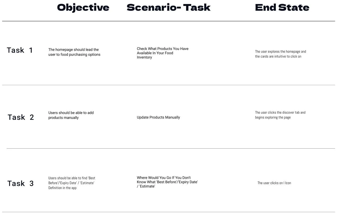
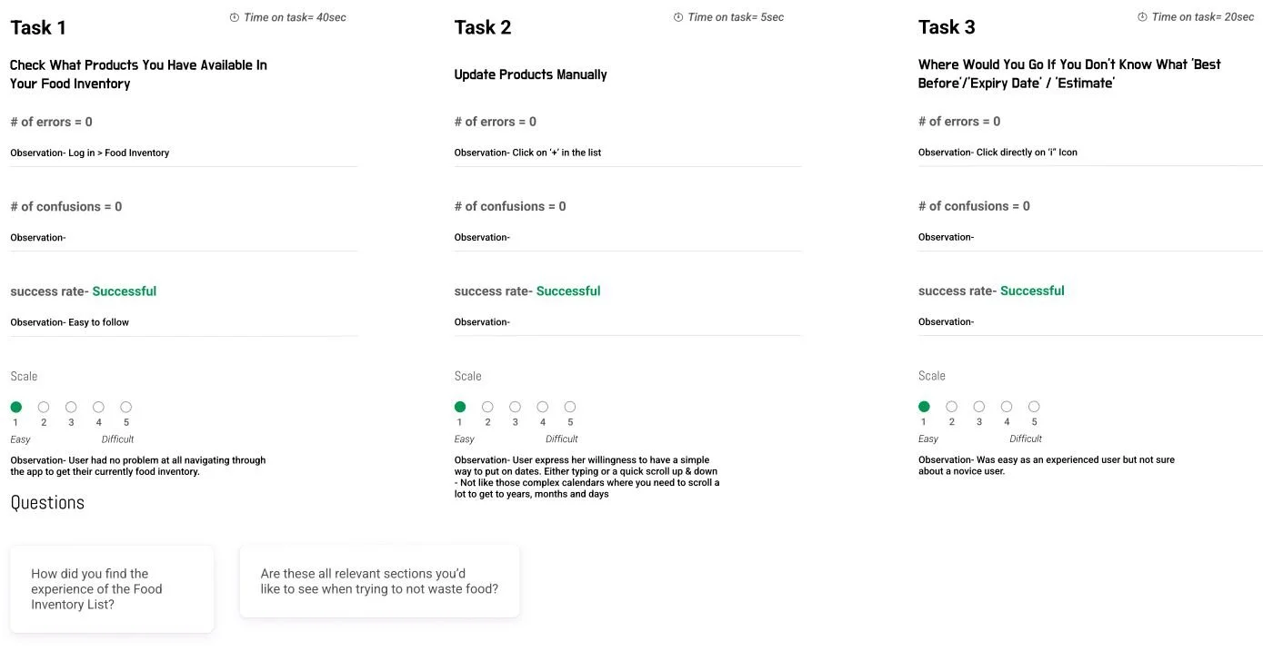
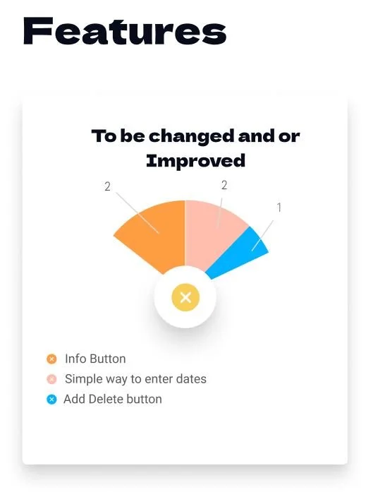
I then conducted a usability test to validate the purpose aligns with the user preferences. This involved observing real users interact with the prototype to gain insights into their behaviors, needs, and expectations.
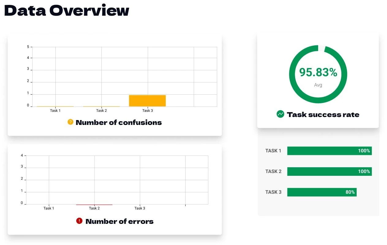
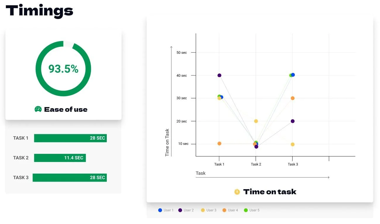
Continue scrolling to find a brief overview of key discoveries.

What’s Next?
1.
Prioritize working with Medium-severity issue(s) and then low-severity ones
2.
Sketching of new features / redesign / prototype
3.
A / B Testing
Learnings
Learning Figma and Miro became a game-changer in this project, enriching my design toolkit. It has challenged my preconceptions, highlighting the importance of adaptability in the ever-evolving design world. Overall, the experience significantly contributed to my growth, shaping my design approach and emphasizing the value of continuous learning.

